Using SVGR with the command line to transform SVG files from Figma
30 May 2022
I am releasing a book about the React Native ecosystem, which covers everything I wish I had known before I started working with this technology.
If you appreciate my work and would like to show your support, please check the Road to React Native.
When you work as a React Native developer, at some point you will google this: How to pass parameters to my SVG Component?
Featured on the React Native Newsletter
A few hours after publishing, this article was published in the React Native Newsletter. Check out issue #153 here.
The problem
As a developer, creating react-native components from plain SVG files makes us waste a lot of time. With svgr/cli we can automatically generate a component from one SVG file or from an entire folder.
In this article, we will see how to use svgr to generate react components compatible with React Native.
How to make a script to automate the creation of React Native components from SVG
I am a big fan of street fighter. Since my 13 years old I have known the concept of a hitbox. Basically, a hitbox is a representation of the area where you can hit your opponent.
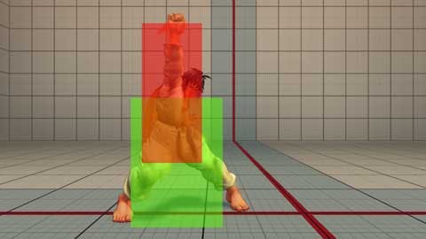
Over the ages, I noticed a lot of professional designers don't know this concept. I don't understand why, because It's impossible to align vertically, horizontally, and scale icons if they don't have the same hitbox. For me, it's like being a graphic designer and not considering how the colors will be printed.
From a coding perspective, the hitbox is the SVG property viewBox. The value of the viewBox attribute is a list of four numbers: min-x, min-y, width, and height.
It's impossible to align vertically, horizontally, and scale SVG icons if they don't have the same viewBox.
The first step is to prepare all the icons.
Step 1: prepare the assets
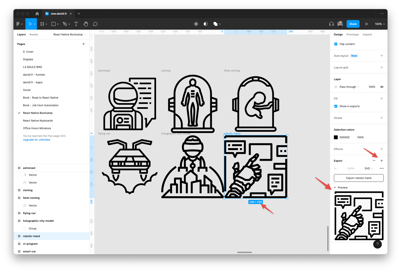
Double-check your SVG's have the save viewBox. if it's not the case open a new file on Figma and export the files again —in this example the viewBox will be 256x256.
Step 2: Create a script
Update your package.json with a new script "icons:create". It will allow you to run yarn icons:create later.
// package.json
{
  "scripts": {
     ...
     "icons:create": "npx @svgr/cli --native --typescript -d ./src/components/icons ./src/components/icons/source --config-file ./src/components/icons/svgr-config.json --template ./src/components/icons/svg-template.js",
   }
}
I will break down all the parameters for you.
- npx @svgr/cli We will download locally the last version of svgr every time
- --native forces to delete props that are not compatible
- --typescript who's not using TypeScipt these days?
- -d ./src/components/icons ./src/components/icons/source destination / source folder
- --config-file ./src/components/icons/svgr-config.json you can specify some configuration here
- --template ./src/components/icons/svg-template.js the output template component
Step 3: SVG configuration file
Add the svgr config file in the same folder as the svg file.
// src/components/icons/svgr-config.json

{
  "typescript": true,
  "removeViewBox": false,
  "replaceAttrValues": {
    "white": "{props.color || `#FFFFFF`}",
    "#FFFFFF": "{props.color || `#FFFFFF`}",
    "black": "{props.color || `#000000`}",
    "#111111": "{props.color || `#000000`}",
    "#000": "{props.color || `#000000`}"
  },
  "svgProps": {
    "width": "{props.width || 256}",
    "height": "{props.height || 256}"
  }
}
Noticed here we can fix poorly designed icons that are not using a consistent colors style and transform all colors to #000000.
Step 4:
Add the svg-template that will create React components for you.
// src/components/icons/svg-template.js

const comments = `
// Auto-generated file created by svgr-cli source svg-template.js
// Run yarn icons:create to update
// Do not edit
`;
const template = (variables, { tpl }) => {
  return tpl`
${comments}
${variables.imports};
${variables.interfaces};
const ${variables.componentName} = (${variables.props}) => (
  ${variables.jsx}
);
${variables.exports};
`;
};

module.exports = template;
Step 5:
From your terminal start the script to create SVG components.
yarn icon:create🎉 Your components are created.
Step 6:
You can now use your SVG components ad use the size and color you want.
import React from "react";
import { StyleSheet, ScrollView } from "react-native";
import {
  RoboticHand,
  VrProgram,
} from "./src/components/icons";

export default function App() {
  return (
    <ScrollView>
      <VrProgram color={"red"} />
      <RoboticHand color={"blue"} />
    </ScrollView>
  );
}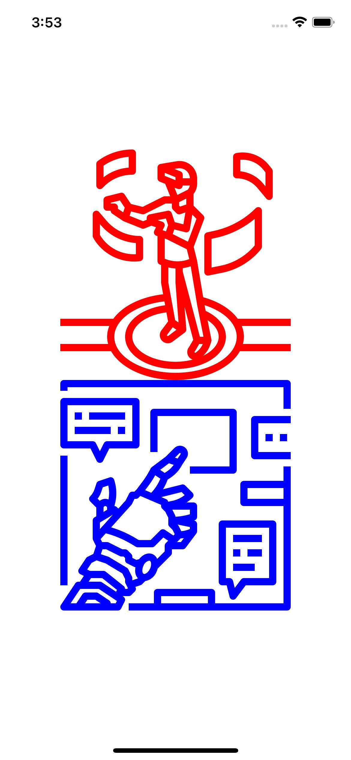
Demo

Hi, I’m David, a french freelance developer working remotely. I’m the author of this blog, nice to meet you!
Subscribe?
Be the first to receive insightful articles and actionable resources that help you to elevate your skills.